Python Matplotlib Bar Charts
We understand data better if we can visualize them graphically. As an example, if I write a description of animals' heights, you may not get the whole idea. But if I visualize the heights of different animals, you can understand what I needed to describe. Summarizing a set of data into a graph means we are converting those data into information. As you know Python is a well known programming language for the data science domain. The main data plotting library we use in Python is the Matplotlib which is a numeric mathematical extension in Numpy. Matplotlib was originally authored by Mr. John D Hunter in 2002 but the current version is developed by someone else. In this article, we are going to master bar plots in Matplotlib.
Let's begin the journey by learning how to install Numpy, Pandas and Matplotlib ;) (we will use Pandas data frames in a next article). I suggest you to install Anaconda because Anaconda comes with a bundle of very useful Python libraries including Numpy, Matplotlib, Pandas, Scipy, etc. But you can run the below two commands on your command prompt (better if you run the command prompt as an administrator) to install Numpy, Pandas and Matplotlib manually.
python -m pip install numpy
python -m pip install pandas
python -m pip install matplotlib
Matplotlib Basic Components
- Figure - Canvas which contains one or more axes (graphs/ plots).
- Axes - The area, your plot appears in. One axes can be in only one figure. An axes can contain many axis and a title.
- Axis - Axis of the graph which appears as number-line-like objects
Simple Graph with Pyplot
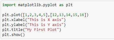
Pyplot is a module in Matplotlib package, which provides simple functions to add plot elements like title, texts, images, lines, etc. to the currently active axes of the currently active figure. To plot some simple graphs, you don't need to import the whole Matplotlib library. You can just import the Pyplot package only and do your task. So let's plot a simple line graph with the below code, which uses
Pyplot module.
Pyplot module.
We have given two NumPy arrays as the parameters of the plt.plot() functions. Those two NumPy arrays represent the data points' X-axis values and Y-axis values. This will plot a graph like below.
But this article is not for line graphs. This article is written to teach you how to plot some advanced bar graphs. Let's get back into the topic.
Simple Bar Graph with Matplotlib
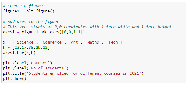
In the line graph, we represented data using markers and connecting those markers with lines. In the same way, bar graphs represent data by using bars of different heights. We can compare different types of data using bar graphs. To create bar graphs, we can use the bar() function in the pyplot module. Let's see what are the parameters of the bar() function.bar(x, height, width, bottom, align, **keywords)
- x = single value or a list of values, representing the x coordinates of the bar
- height = single value or a list of values, representing the y coordinates (bar heights)
- width = width of each bar (default value is 0.8)
- bottom = the starting base of each bar
- align = alignment of the bars to the x-axis (default value is 'center'. other possible value is 'edge')
- **keywords = use to change properties such as color, style, etc. of the bars
Execution of this code will show you a bar chart just like below.
Let's make this bar graph more beautiful with keyword arguments (**keywords). The below code will plot a colorful bar chart with borders for the bars. border size (linewidth) is 5. These colors can be used to show some other information too. As an example, you can show new courses and old courses in two colors.
This code will show you a colorful bar chart like below.
I'm going to end this article because we have discussed a lot of things here and it's a long article now. We can learn how to plot horizontal bar graphs, stacked bar graphs, and grouped bar graphs in the next article. Thanks for reading! Happy Coding!


0 Comments
Post a Comment