Stylish & Advanced Bar Charts in Python
In the previous article, we talked about how to use the Matplotlib library and plot some basic bar graphs with Python. If you didn't read it yet, click here to read the part 1 of this article series. In this article, we are going to learn how to plot some stylish bar graphs such as horizontal bar graphs and also we will learn how to plot stacked bar graphs and grouped bar graphs (multiple bar charts).
Horizontal Bar Graphs
Here we use barh() function to plot horizontal bar graphs. The barh() function also belongs to the PyPlot library. So you need to import Pyplot before using barh() function. First, let's see what are the parameters of the barh() function.
barh(y, width, height, left, align, **keywords)
- y = single value or a list of values, representing the y coordinates of the bar
- width = single value or a list of values, representing the length of each bar
- height = height of each bar (default value is 0.8)
- left = the starting base of each bar
- align = alignment of the bars to the x-axis (default value is 'center'. other possible value is 'edge')
- **keywords = use to change properties such as color, style, etc. of the bars
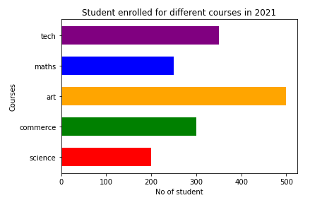
Let's see a Python code example. So you will realize that you just need to swap parameters of the vertical bar graph to plot a horizontal bar graph. I have added comments to make it more understandable.
Execution of this code will show you a bar chart just like below.
Grouped Bar Graphs (Multiple Bar Graphs)
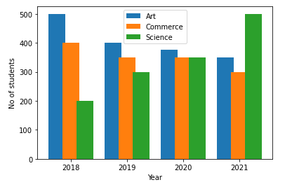
What do you do if you need to plot a graph to see how many students have enrolled for each course each year? You will definitely go with a multiple bar graph. All we have to do to plot a multiple bar graph in PyPlot is to draw multiple bar graphs in the same axes. Refer to the below code to see how to do it in Python3.
Execution of this code will show you a bar chart just like below.
Stacked Bar Graphs
The next thing we are going to learn is stacked bar graphs which can represent the same information as in the grouped graph but in a different view. In the stacked bar graph view, it's very easy to see the total summation of the sub bars. To plot a stacked bar graph, we use the same Pyplot bar() function but especially we use the bottom argument of that function. If you can't remember the bottom argument, please read the first article of this series.
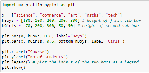
Let's see how to code to plot a stacked bar graph in Python3. Here we are going to plot how many male students and female students have enrolled for each course. You have a challenge to convert the above multiple bar graph into a stacked bar graph later.
As you see, the only change we have done for the basic bar graph is that adding the bottom parameter to the bar() function. Let's see the output of the above code.
Now you can see the total enrollment of each course as well as the girl vs boy distribution in each course. Remember the challenge you have? Try to do it and comment your experience below. Happy coding!


2 Comments
Superb ♥️
ReplyDeleteThanks ♥️
DeletePost a Comment