Convert Pandas Data Frames into Bar Graphs
In the previous article, we talked about how to use the Matplotlib library and plot stylish and advanced bar graphs with Python. If you didn't read it yet, click here to read the second part of this article series. In this article, we are going to plot bar graphs directly from Pandas data frames very easily. I thought to write this article because we all use Pandas data frames to manipulate datasets and we need to analyze datasets with graphs before starting to use that dataset. So, plotting and visualizing data in a Pandas data frame is very important and it will be very useful if we can directly convert a data frame into a graph.
Load a Dataset
First, you need to download a dataset to analyze. But here we are going to create our own very small dataset because it will be very easy to explain what we are going to do with a simple dataset. First I create a Python dictionary (click here to learn the power of Python dictionaries) and convert it to a pandas data-frame by using the below Python code.
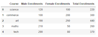
After running this code, df.head() code line will show you the data-frame, we created. Let's create a new column "Total Enrollments" with the below code just for fun ;)
Then our final data frame will be looked like the below table.
Plot Bar Graphs with Pandas Data Frame
Now we are going to convert those data into a bar plot with a single line of code. Let's create a simple bar graph with the below single Python code line by taking "Total Enrollments" to the y-axis and "Courses" to the x-axis.If you need to plot a different kind of graph, you just need to change the kind parameter. You can try the below values for the kind parameter.
"area"is for area plots."bar"is for vertical bar charts."barh"is for horizontal bar charts."box"is for box plots."hexbin"is for hexbin plots."hist"is for histograms."kde"is for kernel density estimate charts."density"is an alias for"kde"."line"is for line graphs."pie"is for pie charts."scatter"is for scatter plots.
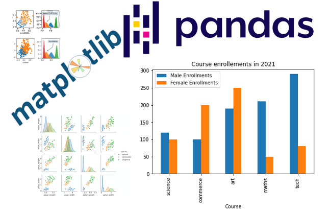
Now let's plot a multiple (grouped) bar graph by taking "Male Enrollments" and "Female Enrollments" for the y-axis and "Courses" for the x-axis.
That's it. Hope you learned everything about Python3 Pyplot bar graphs from this article series. Leave your comments below and let me know if I have missed anything about Pyplot bar graphs. So, I can add those info for you. Happy coding!


0 Comments
Post a Comment